Wednesday, 21 December 2016

Retarus Charity Game is Bridges of Koningberg

Julie sent me a link to this game, and said I should play it, as it supports Techtonica, which does great things (copying from their webpage): "Free tech training with living and childcare stipends and job placement for low-income women and non-binary adults. #BridgeTheTechGap".  Great, I'm on board with all that.

The game is essentially a more complicated version of the Bridges of Koningsberg problem.  There are nodes you need to pass through, and you can't retrace steps.  I did the first 17 levels before realizing I should get back to work, so I waited until I got home to finish all the levels (and bring Techtonica above 50000 stars.  I assume everybody gets some money, and that it's not some sort of monstrous three charities enter, one charity leaves thing).  It wasn't until level 29/30 that I realized that there had to be some sort of algorithm to solve these, and not just "magical topology powers."  So I sat down to write out what I was doing with diagrams and words, to make sense of it.


Here's the board.

Nodes with only two edges must be traveled through both, obviously.

So, we can block off any route that the two-edge nodes force us to exclude.
 I ended up largely solving this from the end, because I know a path must go to the terminal node, and that immediately forces the route into the two nodes in the bottom right corner.  Knowing that the intermediate node already had two edges on the path excludes any other path from using the other two edges.
And this provides the next big hint to how the algorithm works:  Once you've blocked edges from being part of the path, you turn some nodes that were previously connected to 3+ nodes into 2-edge nodes, so you can iterate the process again.  I've labeled the first node that is downgraded like this with a star.

Another round of marking and blocking gets the pseudo-path near the start point, but there aren't any clear ways to continue at that end.

Which is good that I noticed that in the upper right, the one edge I crossed off in stage 1a is connected to another edge that is also forbidden.  This makes the one node a 2-edge.  The square path at the top is redundant, so I chose one to exclude.  This connects those two corner nodes to the straight 2-edge in the middle.

I'm not 100% sure that my solution here is unique, but I'm not redrawing my diagrams again.  In any case, my logic here says that the start can't continue straight past that first target node, as it would then either need to go down (which leads to the end), or straight (back through that 2-edge), which isn't value.  I already excluded the bottom route, so it will need to turn up.  Blocking that route forces the empty node to have 2-edges, which connects the "to-the-end" path with the "back through the straight 2-edge" path.  This blocks the down edge out of the top-center node, forcing it to be a turn.

That forces the empty node above it to have one exit blocked, and then things fall into place. 
See, 50008.
And I think that this algorithm solves any similar game, although there are two edge cases.  The first is when the grid is over connected with edges.  This should always have trivial solutions that are obvious (and the early stages have extra connectivity, and that simply means that there are multiple paths that are valid.  Path length was not a constraint).  The second problem case is when the objective is not possible because it's a true Bridges of Koningsberg problem with no solution.

Tuesday, 25 October 2016

Urban/Rural Populations


I saw this tweet this morning as part of a thread, and it didn't quite seem right to me.  The urban/rural factor is certainly one component, but it seems like race and income should also be major factors.  Unfortunately I didn't fully dig through the census site to find a data set that contains all those variables, so this is just an analysis of the census county based urbanization statistics and the 2012 presidential election outcomes on a county basis.  To be completely fair, this is only an analysis of the subset of those two data sets that have identical spelling/spacing for the county names, so 3069 counties from the 3222 available in the census sample.  A quick check seems to indicate that Alaska and Puerto Rice aren't matched between the two.

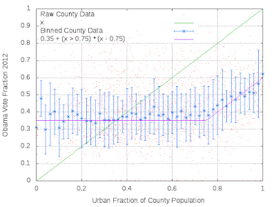
In any case, plotting the vote fraction for Barack Obama as a function of urban population fraction doesn't show a overly strong trend:

There is a lot of scatter in this relation, but there is an uptick for the most urban counties.
Smoothing the data by taking medians/robust sigma values in 0.02 wide bins shows the uptick clearer.

The purple "fit" is simply a constant with a break to linear placed to match the binned data.
This suggests that for the vast majority of counties, there's little change, but once a certain threshold of urbanization is reached, the median county becomes more likely to vote Democratic as it urbanizes.  A fuller description would try to disentangle this effect from racial, economic, educational, and simple population based components.

One interesting thing to note is that only about a third of the country lives in a county below that break point.  This plot is just the CDF of the population data plotted as a function of the urbanization metric.

Saturday, 27 August 2016

I'm positive those elevators are making different sounds.

My apartment building has two elevators, descriptively labeled "elevator 1" and "elevator 2".  Recently, something happened, and elevator 2 was out of service for nearly a month.  When it started working again, the floor display didn't work, and the sounds sounded vaguely off.

Over the past two days, I've been trying to ride on both, so I could take videos that I could then extract the audio and do a power spectrum analysis on the beeps.

Those peaks are definitely different.
One thing to note is that the elevator 1 audio is much noisier than elevator 2.  I suspect this is partially my fault (holding the phone in different ways), but it points out another difference since elevator 2's problem: elevator 2 no longer has a functional fan.  There's also some noticeable impacts of my phone's microphone, with the dip at 5500 Hz and 8000 Hz.

The spikes are clearly the sound of the beep, and taking the peaks of the ~1000 Hz spike shows that elevator 1 has the peak at 1007.8125 Hz, with elevator 2 at 937.5 Hz (with these values being very dependent on the fairly low sampling frequency I'm using.  The samples are separated by 23.4375 Hz).

It's easy to scale elevator 2 by the ratio of the peaks.

This aligns the peaks at ~3000 Hz and ~4000 Hz.  The lower noise elevator 2 suggests a peak at ~2000 Hz as well.

So yes, those elevators are definitely making different sounds.


Sunday, 21 August 2016

It seemed like there were more women's sports in this Olympics. Is that because they did better?

First up, it's entirely possible that this feeling is just because I never really watch any sports, and the news tends to focus on men's sports (with the possible exception of soccer).  Therefore, against that background, seeing any women's sports might just feel like an improvement.

However, given that NBC tape delayed everything, they had a large amount of leeway to tune what they programmed based on the results they already knew.  In this case, making events where the US won a medal more prominent might help increase ratings.

Conveniently, wikipedia lists all the results, and has a nice set of tables about how the US did.  So the question is: did the women's events produce more medals per participant than the men's events did?

To get a reasonable answer, I simply counted the number of medals won (split by type) per sport category, and divided by the number of participants in that category.  There are some complications with this method.  First, team events produce a higher fraction, so doing well in team events helps.  I've included each team member as a separate medal, and after some minor research, include the team members who didn't participate in the final.  I had them excluded on the first pass, but looking around it seems like those team members do get a medal as well.  This doesn't change the final numbers by much (mostly it just bumps swimming up even more).  Second, this ignores the Biles/Ledecky/Phelps effect, where one person dominates a sport heavily.  Still, normalizing by total participants ensures that it's not just a case of flooding a sport with lots of people, and winning that way.

So the results are:
Full sample average at 44.6%.

Full sample average at 51%.
Obviously there's lots of scatter.  Also obvious is that there is no good angle to rotate the labels to prevent overlaps.  In any case, all those nights of swimming, gymnastics and volleyball make sense, as those are sports that the women do well in.  Same for men's diving, although men's gymnastics might have been slightly over represented.

I also don't remember seeing any basketball, but that might have been sent to one of the other channels, and not the main NBC.  It's also possible based on the score differentials, that NBC just decided that those would be very boring games to watch, and skipped them for that reason.

Tuesday, 19 July 2016

How does bedtime change with age?

I saw something earlier today that made me wonder how people's bedtime changes as they get older.  A quick google search pointed me to this study, which is probably the best/easiest to find data set that I'm likely to find just sitting online waiting.  There are a few obvious flaws:


  1. It relies on users of the Jawbone UP for the data sample.  I have never heard of this device, and I'm guessing a lot of people are in the same boat.
  2. Of those that do know of the Jawbone UP, they're probably younger than the average person, just because young people tend to use new tech at a higher rate.
  3. There's likely class/income/etc. biases, as not everyone has the money to spend on a $50 fitness doodle.
  4. There isn't actually any age data in the data set.
That last one isn't really that big of a show stopper.  

First step, scan through the source code to find the file that actually contains the data being used for the interactive map.  It's called counties.prod_.js, and nicely lists the county and state, bedtime in 12-hour format (minus 7, likely to ensure that there isn't a problem at the midnight boundary), as well as some other data I parsed out and saved in case I want to revisit something later.

Second step, trawl through the Census data for a county-by-county population breakdown, with age information.  That's here (although the full country data is actually 112MB, not the 11MB the page claims).  Then it's just a matter of pulling out the population data for 2015 (the closest match to the sleep data), setting the age for entire age groups at the midpoint, and calculating the weighted average age for each county (using the population in the age group as the weight).

So what's the result?
Other than me not truncating the best fit line.

The answer seems to be "Yes.  Bedtime is slightly earlier for older counties."  There's a bit of a plateau in the 16-20 range, but there's a reasonable decrease, even with the scatter.

Of course, using the full population isn't really the best, since the users of the Jawbone UP are likely adults, and not kids.  Redoing this analysis with just people older than 20 (due to the way the census data is binned into 5-year groups):


Basically the same, just shifted to an older age.


Wednesday, 22 June 2016

Working to get a consistent set of census data.

It's annoying, because the census doesn't have a single format that they use for all historical data.
Particularly in the effectively arbitrary old age cuts.  Why were they fine during the 80s, then slightly worse in the 90s, and then really bad in the 2000s?  No clue, but that's the data I have from the census, so that's what I'm using.  
The gap is from the lack of data between 2010 when the previous decade estimates stop and 2014 when the future projections begin.
This is kind of interesting too.  I initially started just plotting the population with age=0, with the intent to visualize generations.  The baby boom is really obvious in the purple curve.  I then added samples at different ages, lagged to use a consistent time base.  This thought this would give a probe of immigration, but that doesn't seem to be the case, as there aren't any major gaps in the first three samples in the 1850-1900 range.  I think the sag in the age=60 is just life expectancy issues.  That's also clearly apparent in the beyond 2000 area as well.  The projection yielding the 2014-2060 isn't predicting that to improve too much it seems.

Friday, 29 April 2016

Dumbing of Age characters

I read Dumbing of Age, but I don't really pay super close attention to things.  There are 1773 comics as of today, and it's hard to keep track of stories that long over a long period of time.  There are also a lot of characters that I have trouble keeping track of.  "Wait, how do you know how many comics it has?"

Today's story is all "Amber pushes Danny away because she's angry and making bad decisions."  My thought was, "Who else is Amber's friend?  Joyce, right?"

amber danny 91 0.408072 0.325
amazi-girl danny 40 0.3125 0.142857
amber ethan 60 0.269058 0.285714
amber dina 53 0.237668 0.24424
amazi-girl dorothy 24 0.1875 0.0526316
amazi-girl joyce 19 0.148438 0.0255376
amazi-girl walky 18 0.140625 0.0392157
amber joyce 30 0.134529 0.0403226
amazi-girl sal 16 0.125 0.0695652
amazi-girl amber 15 0.117188 0.0672646

Ethan, Dina, and then Dorothy maybe.  Yeah, I was wondering this enough that I wrote a bot to scrape all the comics to pull out the tags that are applied to each comic, since conveniently list all the characters appearing in that comic.  Then, I looked at the pairwise matches in that set and dumped them out in "character A", "character B", "number of appearances together", and number of appearances for each of A and B, converted here into fractions of all appearances that are together.

So that was waste of time.  I also have dates, and you can extract chapters from the urls (which I saved), so more analysis could be done (my thought was to try to do some sort of connection map), but I still haven't eaten dinner.  Also, I discovered that this comic is the only one to have no characters appearing, so had to handle that case (SOLO_APPEAR is in that with SOLO_APPEAR).

Thursday, 28 April 2016

Why is that so noisy?

Julie sent this video to me, and I was confused, because I didn't think it should saturate into noise on the third iteration.  Human voices are in the 1000 Hz range, so if the Carl doubles the frequency, three iterations only gets it to 8000 Hz, which is still well sampled by a 44 kHz sound file (the standard).  So, I did the sane thing when I got home, which is to download the video and do spectral analysis of the audio.
The human (s00), Carl A (s01), and Carl B (s02).
The human speech is mostly that tiny red peak on the left side, at about 1-2 kHz.  It's confused beyond that, but I think that second red peak (2k ish) can be plausibly shifted in the others.

Plotting everything.
The interesting thing in this one is that you can see that there are two patterns.  The dips around 11k and 13k are probably the easiest way to see that.  They're caused by the response function of the devices:
Carl A has the benefit on the first iteration to have the true voice.

Carl B.
 So I don't think it's really related to the speech frequency vs sampling rate.  I think it's just the addition of the noise in the microphone/speaker feedback.

Wednesday, 30 March 2016

This is kind of like reruns. Maybe it's a "remastered" post?

First up, killing the Supreme Court.  Again.  But still with numbers and statistics, because that's the best way to do things.  Assume the Senate decides to stop being dumb.  Then, Merrick Garland gets a hearing and since he's basically fine, he gets a seat on the Supreme Court.  Since my least favorite justice is dead.
So here's the cumulative "how many justices are alive" plot.  Honestly, according to this, if the Senate doesn't stop acting like children, Obama might have two more people to appoint before the end of his term.  It's good that the Republicans aren't running serious options this year, since that sets up a good shift when they don't become president.
And the by name individual plot.  I've seen a lot of stuff talking about how Garland is "already old" so it "doesn't matter" if he gets confirmed or not.  This is stupid.  The cumulative plot clearly shows that the next president is very important for determining the Supreme Court's future.
In any case, he's younger than the median justice, and is likely to be on the court for another ~15 years.  Or, you know, the next four presidential terms.  Also, it's interesting to note the benefit of appointing women to the court.  Roberts was born in 1955, and Sotomayor in 1954.  That's the unit the script uses for sorting the key.  But, looking at the graph, Sotomayor is likely to be on the court ~3 years longer.  I should also enable the grid display next time I do this.

Sunday, 27 March 2016

Final final four

Today's also the last day I update the sports stuff for this year.  Here's the table for the rest of the tournament:

#BracketN_R1PP_R1Nwrong_R1P_R1S_R1N_R2PP_R2Nwrong_R1P_R2S_R2
Mine321626.995162450.998
Heart-of-the-cards3211022.656162838.320
Julie3211022.656162642.738
BHO321923.823162643.820
538321824.928162742.738
Rank3211319.129162639.424
#BracketN_R3PP_R3Nwrong_R3P_R3S_R3N_R4PP_R4Nwrong_R4P_R4
Mine84370.99890348378
Heart-of-the-cards84646.04448446
Julie84458.61048458
BHO84459.67448367
53884266.95548282
Rank84263.87548371
#BracketN_R3PP_R3Nwrong_R3P_R3N_R4PP_R4Nwrong_R4P_R4
Mine216278132178
Heart-of-the-cards216246132146
Julie216258132158
BHO2161+67+132167+
538216282132182
Rank216271132171

If the President gets his pick correct in the next round, then he'll win with an 83.  Otherwise, 538 wins based on only getting two wrong in round 4.  Everything else is locked in now, so there's nothing really to update anymore.

Friday, 25 March 2016

Round 3

Since it's the weekend, it's sports time.  First up, my picks for this round of things:
One that I was doomed to get wrong.

And the other doomed one.  But a new mistake!

Texas A&M:
29.687500       14.062500       3.125000                3       6       3       Texas A&M
28.125000       18.750000       21.875000               3       8       2       Oklahoma

First up, I think my analysis notes have been wrong on the previous posts.  The file I'm pulling these numbers from is in 2016/2015/2014/group/game/rank/name format, not 2014/2015/2016 format.  This changes the analysis for some of my previous mistakes, but I'm too lazy to go correct those.  In any case, using this new, correct information, it looks like I thought (from the 2016 ratings) that Texas A&M should be slightly better than Oklahoma.  Folding in previous years could have potentially altered that choice.

I was thinking a bit about adding some score-based information in as well.  The idea being that each team scores a given median number of points across all their games, and have a given median number of points scored against them.  By comparing how well a given score ranks in all their games, and against their opponent's, it should be possible to construct offense and defense ratings.  This might be useful to say, "Team X is generally better, but they only are a +1 in offense, and they're playing a +4 defense, so they might not win."  The other benefit would be to add two new metrics, which could then be used across the full multi-year dual-gender score set to determine which relative weights each should be assigned to a more complete prediction model.

I think the first step that I should do, though, is to dump all of that data into a database, instead of using horrible fixed-width formatted files to manage things.  That's largely a consequence of not really caring a lot about the project.


In any case, here's the comparison table for round three:

#BracketN_R1PP_R1Nwrong_R1P_R1S_R1N_R2PP_R2Nwrong_R1P_R2S_R2
Mine321626.995162450.998
Heart-of-the-cards3211022.656162838.320
Julie3211022.656162642.738
BHO321923.823162643.820
538321824.928162742.738
Rank3211319.129162639.424
#BracketN_R3PP_R3Nwrong_R3P_R3S_R3N_R4PP_R4Nwrong_R4P_R4S_R4
Mine84370.99890348
Heart-of-the-cards84646.04448
Julie84458.61048
BHO84459.67448
53884266.95548
Rank84263.87548

This now has the added columns of S_RX.   These are my simulated CDF values based on the Yahoo selection pick fractions given for each team.  This is another piece of kind-of garbage code that I threw together earlier in the week.  I think it's doing everything correctly, but I don't see any simulated results that get a total score above 83, and yahoo does list some in their leader list.  Maybe 1e6 simulations isn't sufficient to fully probe things?  Maybe I'm truncating or rounding something odd?  The main idea behind this calculation is to see how well a given set of picks should rank.

Plots for individual rounds and the total after three.  In general, the mean drops (because past mistakes have continuing consequences) and the variance increases (because there's the 2^N point scaling thing and because the number of individual games is falling as well).

Sunday, 20 March 2016

Round 2

today was the end of round two of the sports thing.  I also need to go back and update posts with the new label I've decided is probably useful, "sports".  So I updated everything before the final game was over, and then had to double check nothing went wrong:

Copying from 538.  Two of those I didn't care about anymore due to prior choices, one of them I kind of knew was going to be the case, one of them I wasn't expecting to take two overtimes to come to my result, one apparently fell apart in the last two seconds, and the final one had me frowning at it until it decided not to make me re-edit all my stuff.
 Results for this time:


Again, three of my four mistakes this time around were caused by my winning choice being eliminated in the previous round.  For the last one:

Xavier:
12.500000       42.187500       29.687500               2       7       7       Wisconsin
34.375000       12.500000       14.062500               2       8       2       Xavier

Why did I choose Xavier?  Did I get confused and use the 2014 rankings instead of the 2016 ones?  This looks like me being dumb.  Maybe I took the #2 ranking too seriously?  I should probably write down logic notes next time, so I can point to the error directly.

What does the scoring comparison look like?

#BracketN_R1PP_R1Nwrong_R1P_R1N_R2PP_R2Nwrong_R1P_R2
Mine321626162450
Heart-of-the-cards3211022162838
Julie3211022162642
BHO321923162643
538321824162742
Rank3211319162639

Again the "rank" method is garbage, and shouldn't be used.  Nate Silver had a tweet earlier about how this is apparently because it's based on RPI too much.  Looking at wikipedia, it looks like RPI is an incomplete version of my LAM method.  ¯\_(ツ)_/¯  This also shows the point where HotC totally falls apart, becoming the worst method.  Everyone else is pretty well clumped together.  I'm a bit surprised that 538 isn't doing better, given the "we included scores, and at-home values, and distances to the games, and the number of cats each player owns, and the SAT scores of each player."

This also makes me think I should have actually entered my selections into some pool.  Maybe I should hone the method a bit more, and see how it works over a few more years.  Or, alternatively, I could do the reasonably easy thing and apply the method to the historical data, and see if this consistently matches reality.  Maybe next weekend, since I think it's a long one.  This will also make me fix my master Makefile to put things into logical directories, and not just dump the outputs into a common directory.

Friday, 18 March 2016

Round one

Statistics results.

Ok, that West Virginia loss is going to hit the later rounds.

As is Purdue.  Not as bad as Michigan State, obviously.
Let's look at the comparison table:

#BracketN_R1PP_R1Nwrong_R1P_R1
Mine321626
Heart-of-the-cards3211022
Julie3211022
BHO321923
538321824
Rank3211319

The columns are the bracket identifier, the number of games in the round, the points per correct selection in the round, the number wrong, and the total points.  The brackets are mine above, the "Heart of the Cards" bracket taken by simply selecting teams based on the 2016 ranking I calculated, Julie's bracket, President Obama's, the 538 bracket taken by assuming constant composite rankings from their pre-tournament predictions, and a dummy bracket constructed by selecting teams based solely on their "sport rank" thing.  That's actually working out a lot better than I expected.  I was correct in shaking up the straight HotC numbers with a bit of historical data.  Looking at the mistakes:

Arizona:
26.562500       43.750000       40.625000               1       5       6       Arizona
25.000000       37.500000       53.125000               5       1       11      Wichita St

I didn't believe the numbers, given the #11 ranking.  From above, I should ignore the ranking in the future, because it's pretty crappy.  The problem is that my numbers suggest that Wichita State is the best team in the entire thing, which doesn't seem like it's right.

West Virginia:
28.125000       21.875000       1.562500                2       6       3       West Virginia
34.375000       39.062500       45.312500               2       6       14      SF Austin

Ditto.  My numbers predict that SF Austin is the second best team.  I guess if either of them come out winning, I can say that I predicted it, and then tossed it in the trash.

Baylor:
17.187500       23.437500       20.312500               3       3       5       Baylor
25.000000       18.750000       7.812500                3       3       12      Yale

No clue, but it sounds like everyone was surprised by this one.

Purdue:
29.687500       14.062500       -3.125000               4       3       5       Purdue
37.500000       -7.812500       -3.125000               4       3       12      Ark Little Rock

My numbers say they both suck, so I went with last year's numbers to break the tie.  I could have added in the 2014 values, but this was a #12 ranking, and I didn't believe those.

Dayton:
28.125000       26.562500       20.312500               4       7       7       Dayton
9.375000        7.812500        34.375000               4       7       10      Syracuse

This one I should have gotten right.  I folded the two previous years in, and that said that I should trust consistency over a sudden jump.  Maybe Syracuse has some new great player.

Michigan State:
35.937500       18.750000       28.125000               4       8       2       Michigan St
23.437500       3.125000        23.437500               4       8       15      MTSU

Again, this one seemed like it was a surprise to everyone.  There are only three values of my ranking between these two values, so that kind of suggests they're within ~5% of each other in terms of skill.  Oh well.

Tuesday, 15 March 2016

I didn't really do any of the improvements I discussed two years ago.

Basketball

Basically my solution this time was:

  1. Check with Julie that no team went undefeated this year.  That was my big problem last time.
  2. Run the 2016, 2015, and 2014 game solutions to determine the relative rankings for all of the teams in each of those years.
  3. Rank things based on the 2016 solution, letting 2015 solutions break ties.  Also use this information (and the 2014) for solutions to:
  4. Anytime a #12 sport-ranked team is ranked substantially above a 1-4 sport-ranked team, assume something is off with the model, because I have a lot of #12 ranked teams ranked really high for some reason.
So the result table is:


#2014.score     2015.score      2016.score    group   game  sport-rank  2016.score      Team.name
23.437500       28.125000       40.625000       1       1       1       40.625000       Kansas
-9.375000       -21.875000      1.562500        1       1       16      1.562500        Austin Peay
18.750000       -3.125000       17.187500       1       2       8       17.187500       Colorado
29.687500       7.812500        20.312500       1       2       9       20.312500       Connecticut
3.125000        32.812500       26.562500       1       3       5       26.562500       Maryland
9.375000        20.312500       29.687500       1       3       12      29.687500       S Dakota St
10.937500       4.687500        20.312500       1       4       4       20.312500       California
14.062500       14.062500       34.375000       1       4       13      34.375000       Hawaii
40.625000       43.750000       26.562500       1       5       6       26.562500       Arizona
NAN     NAN     NAN     1       5       11      NAN     VAN/WICH
1.562500        18.750000       28.125000       1       6       3       28.125000       Miami FL
14.062500       21.875000       9.375000        1       6       14      9.375000        Buffalo
12.500000       15.625000       17.187500       1       7       7       17.187500       Iowa
-20.312500      23.437500       15.625000       1       7       10      15.625000       Temple
37.500000       46.875000       37.500000       1       8       2       37.500000       Villanova
3.125000        -1.562500       17.187500       1       8       15      17.187500       UNC Asheville
21.875000       20.312500       34.375000       2       1       1       34.375000       North Carolina
NAN     NAN     NAN     2       1       16      NAN     FGCU/FDU
-15.625000      -12.500000      14.062500       2       2       8       14.062500       USC
18.750000       17.187500       20.312500       2       2       9       20.312500       Providence
3.125000        10.937500       28.125000       2       3       5       28.125000       Indiana
4.687500        18.750000       37.500000       2       3       12      37.500000       Chattanooga
20.312500       53.125000       26.562500       2       4       4       26.562500       Kentucky
18.750000       17.187500       31.250000       2       4       13      31.250000       Stony Brook
-3.125000       37.500000       15.625000       2       5       6       15.625000       Notre Dame
NAN     NAN     NAN     2       5       11      NAN     MICH/TULSA
1.562500        21.875000       28.125000       2       6       3       28.125000       West Virginia
45.312500       39.062500       34.375000       2       6       14      34.375000       SF Austin
29.687500       42.187500       12.500000       2       7       7       12.500000       Wisconsin
25.000000       6.250000        15.625000       2       7       10      15.625000       Pittsburgh
14.062500       12.500000       34.375000       2       8       2       34.375000       Xavier
12.500000       -6.250000       26.562500       2       8       15      26.562500       Weber St
21.875000       25.000000       34.375000       3       1       1       34.375000       Oregon
NAN     NAN     NAN     3       1       16      NAN     HC/SOUTH
23.437500       -7.812500       29.687500       3       2       8       29.687500       St Joseph's PA
32.812500       18.750000       18.750000       3       2       9       18.750000       Cincinnati
20.312500       23.437500       17.187500       3       3       5       17.187500       Baylor
7.812500        18.750000       25.000000       3       3       12      25.000000       Yale
28.125000       40.625000       20.312500       3       4       4       20.312500       Duke
-21.875000      6.250000        28.125000       3       4       13      28.125000       UNC Wilmington
20.312500       10.937500       12.500000       3       5       6       12.500000       Texas
1.562500        42.187500       15.625000       3       5       11      15.625000       Northern Iowa
3.125000        14.062500       29.687500       3       6       3       29.687500       Texas A&M
26.562500       23.437500       17.187500       3       6       14      17.187500       WI Green Bay
0.000000        4.687500        10.937500       3       7       7       10.937500       Oregon St
28.125000       26.562500       23.437500       3       7       10      23.437500       VA Commonwealth
21.875000       18.750000       28.125000       3       8       2       28.125000       Oklahoma
-9.375000       -7.812500       25.000000       3       8       15      25.000000       CS Bakersfield
34.375000       40.625000       29.687500       4       1       1       29.687500       Virginia
7.812500        -1.562500       17.187500       4       1       16      17.187500       Hampton
-6.250000       -9.375000       10.937500       4       2       8       10.937500       Texas Tech
-4.687500       18.750000       17.187500       4       2       9       17.187500       Butler
-3.125000       14.062500       29.687500       4       3       5       29.687500       Purdue
-3.125000       -7.812500       37.500000       4       3       12      37.500000       Ark Little Rock
29.687500       26.562500       15.625000       4       4       4       15.625000       Iowa St
17.187500       26.562500       18.750000       4       4       13      18.750000       Iona
0.000000        1.562500        26.562500       4       5       6       26.562500       Seton Hall
34.375000       46.875000       29.687500       4       5       11      29.687500       Gonzaga
14.062500       25.000000       28.125000       4       6       3       28.125000       Utah
4.687500        -3.125000       25.000000       4       6       14      25.000000       Fresno St
20.312500       26.562500       28.125000       4       7       7       28.125000       Dayton
34.375000       7.812500        9.375000        4       7       10      9.375000        Syracuse
28.125000       18.750000       35.937500       4       8       2       35.937500       Michigan St
23.437500       3.125000        23.437500       4       8       15      23.437500       MTSU
-1.562500       10.937500       9.375000        5       1       11      9.375000        Vanderbilt
53.125000       37.500000       25.000000       5       1       11      25.000000       Wichita St
14.062500       17.187500       10.937500       5       2       16      10.937500       FL Gulf Coast
-17.187500      -20.312500      6.250000        5       2       16      6.250000        F Dickinson
26.562500       0.000000        15.625000       5       3       11      15.625000       Michigan
14.062500       18.750000       14.062500       5       3       11      14.062500       Tulsa
9.375000        -3.125000       -7.812500       5       4       16      -7.812500       Holy Cross
9.375000        1.562500        15.625000       5       4       16      15.625000       Southern Univ

So, using this, I can answer the following questions I saw while doing the research of "figuring out what FLGU means".

  1. I saw a thing asking if Holy Cross was underrated.  My analysis says "no," and concludes with a "holy crap, no."
  2. Kansas is probably going to win it all.
  3. Julie was right, Michigan State should have been ranked higher than Virginia.
  4. I've already scored the two group 5 games that have played correctly.

Using the espn clicky thing to use these rules (I bent rule #4 to also apply to 13-ranked teams as well):

Group 1 and 2.

Group 3 and 4.

Final stuff.  I don't know how to call the score thing.  They're separated by ~4 points in the scores, or about 10%.  So maybe 10 points, since basketball is a "log10(score) ~ 2" kind of game?

For the remaining pre-game things, I have Michigan and Southern University winning those (in addition to the correctly called Wichita State and Florida Gulf Coast).

Monday, 1 February 2016

Normalization followup to last week

Remember last week when I got too lazy and bored to correctly normalize things in the newspaper column detection stuff?  This is probably the correct normalization.  v1 = col_mean / col_sigma; v2 = (v1 - median(v1))/madsig(v1).  This is essentially centering and whitening the tracer signal from last week (v1 here).

Wednesday, 27 January 2016

I just spent a large chunk of the evening fighting something, even after I'd come to an answer I was happy with.

The problem is fairly easy to state: given a printed page, can you reliably determine the column boundaries?  The answer has to be "easily, duh," right?  So, I found a bunch of newspaper images with different numbers of columns, and did some tests. 

First, I wrote a program that did regular and robust statistics on a column-by-column basis, and plotted these up.

The test image.
The normalizations are simply the mean of the given statistic.

So that kind of looks like garbage.  Without the normalization, it becomes obvious that at column gaps, the signal (the mean or median) goes up, as the intensity is brighter.  However, the variance (sigma or MAD-sigma) goes down, as the column becomes more uniform.  Therefore, if you divide the one by the other, these two features should reinforce, and give a much clearer feature:

Which it does.

So, applying it to the image corpus:
http://freepages.genealogy.rootsweb.ancestry.com/~mstone/27Feb1895.jpg

http://www.thevictorianmagazine.co.uk/1856%20nov%2022%20web%20size/1856%20nov%2022%20p517.jpg

http://www.angelfire.com/pa5/gettysburgpa/23rdpaimages/cecilcountydare2.jpg

http://malvernetheatre.org/wp-content/uploads/2012/07/Malverne-Community-Theatre-Newspaper-Reviews-14-page-0.jpg

https://upload.wikimedia.org/wikipedia/commons/b/b8/New_York_Times_Frontpage_1914-07-29.png

http://www.americanwx.com/bb/uploads/monthly_01_2011/post-382-0-70961700-1295039609.jpg

http://s.hswstatic.com/gif/blogs/vip-newspaper-scan-6.jpg

I probably should have kept the normalization factor, but that would require calculating them and sticking them in the appropriate places in the plot script, and I was just too lazy to do that.  Still, this looks like it's a fairly decent way to detect column gaps.  The robust statistics do a worse job, probably because they attempt to clean up the kind of deviations that are interesting here.  Compared to the baseline level, it looks like the gaps have a factor of about 10 difference.  It really only fails when the columns aren't really separated (or they might be, if I bothered normalizing the plots and clipping the range better).